
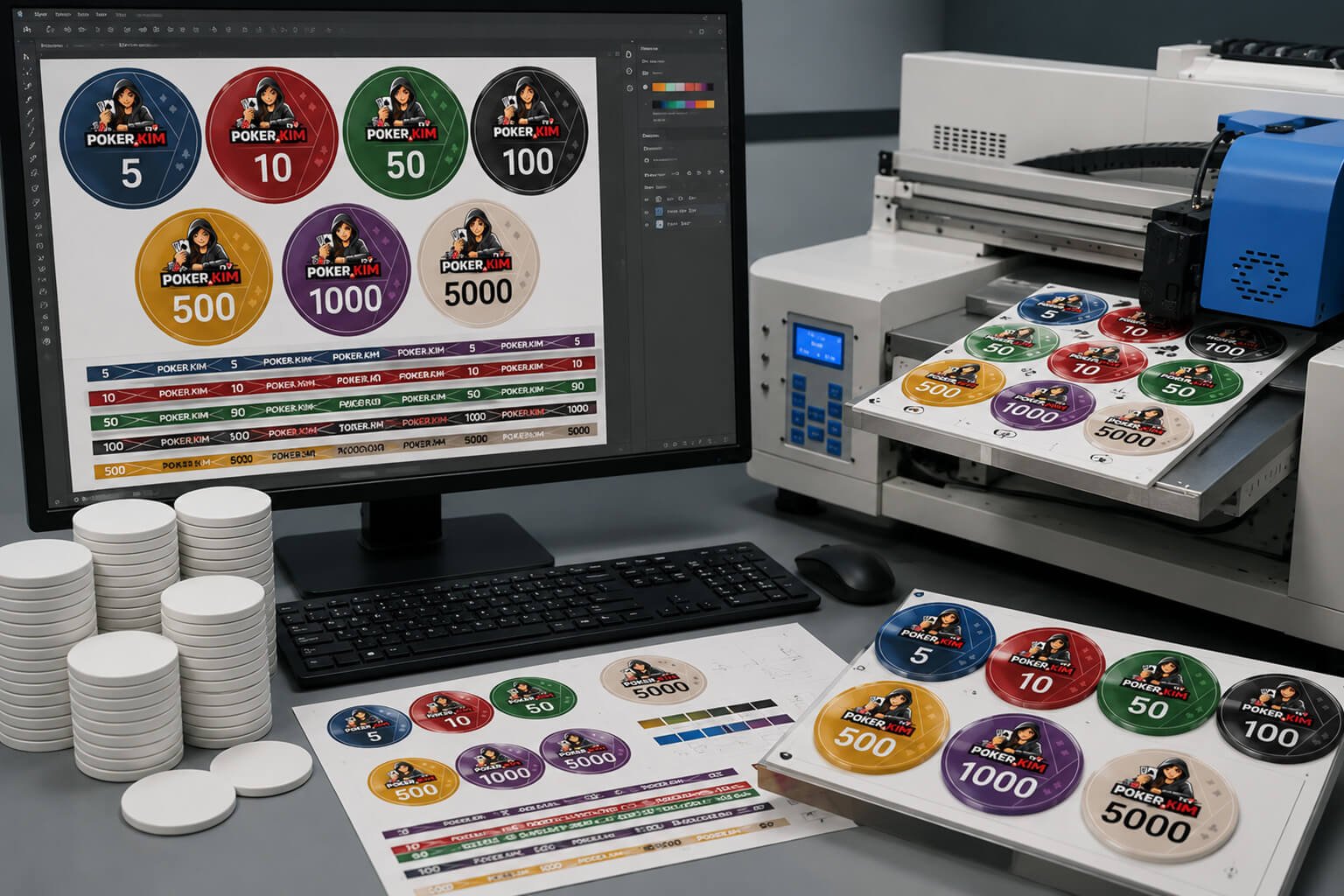
Custom ceramic poker chips give you far more freedom than traditional casino-style chips. Instead of working around a fixed center label or predetermined edge spots, you can create a design that covers virtually the entire chip – including the face and the edges.
That freedom makes ceramic chips perfect for poker clubs, home games, tournaments and anyone who wants a truly unique chip set.
But it also creates plenty of opportunities to get things wrong.
A design that looks fantastic on a computer screen may look completely different once printed on a real poker chip. Colors can become difficult to distinguish, small details can disappear, and two denominations that looked completely different during the design process can suddenly look almost identical when stacked on a poker table.
Here are some of the most important things to consider when designing your own ceramic poker chips.

Understand How Ceramic Poker Chips Are Printed
The first thing to understand is that ceramic poker chips aren’t actually made from traditional pottery-style ceramic. The name refers to the type of smooth, solid chip commonly described as “ceramic” in the poker industry.
One of their biggest advantages is that the design can cover the entire chip.
You aren’t limited to a sticker or label in the center. Depending on the manufacturer, your artwork can continue across the face of the chip and around its edge.
This gives you enormous design freedom.
You can use your club logo, custom patterns, denomination colors, gradients, edge markings and other elements to create something completely different from standard casino chips.
But remember: the chip itself normally starts out white and the color comes from the printed design.
That becomes important both when designing the chip and after years of use.
Are you hosting a poker tournament? Check out all our useful FREE poker tools you can use here
Your Computer Screen Can Be Misleading
One of the easiest mistakes to make is judging the finished product entirely from your computer or phone screen.
A screen produces light. Your poker chip doesn’t.
This difference can have a surprisingly large effect on how a design looks.
A dark blue, black or deep purple design might look rich and vibrant on a bright monitor. Once printed onto a matte poker chip and viewed in a dimly lit poker room, it may look considerably darker.
The same applies to effects designed to look metallic, glossy or illuminated.
If your design contains a beautiful shiny gold effect on your computer screen, remember that you’re still printing that effect onto a matte surface. The chip isn’t suddenly going to become reflective metallic gold.
If the appearance of the design depends heavily on shine, lighting or reflections, there is a good chance you’ll be disappointed with the physical result.

Print Your Design on Matte Paper
There is a very simple test you can perform before ordering your chips:
Print the designs on matte paper.
It won’t perfectly reproduce the finished poker chip, and the colors on the actual chips may be somewhat stronger depending on the printing process. But it gives you a much better impression of the difference between an illuminated screen and a physical matte surface.
Look at the print under normal indoor lighting – and preferably under slightly dimmer lighting as well.
If two denominations are already difficult to distinguish on paper, don’t assume they will magically become easier to identify when printed on chips.
Make Every Denomination Easy to Recognize
Poker chips aren’t only supposed to look good.
Players need to recognize them instantly.
Imagine a player facing a large bet. They shouldn’t have to pick up an opponent’s stack and inspect the denomination printed on the chip to figure out whether they’re looking at 100, 500 or 1,000.
Color is one of the fastest ways for players to identify chip values.
This means each denomination should have a clearly recognizable primary color.
For example, if you’re designing seven denominations, don’t simply choose seven colors that look nice next to each other on your monitor. Ask yourself whether you can distinguish those same seven colors from across a poker table.
Don’t Make All Your Chips Too Dark
This is one of the most common problems with custom chip designs.
Dark colors often look fantastic during the design process. Black, navy blue, dark green, burgundy and deep purple can create a premium appearance.
The problem appears when several of them are used in the same set.
Put those chips in a poker room with relatively low lighting and suddenly your:
- dark blue chip
- dark green chip
- dark purple chip
- black chip
can all look almost black from a distance.
You shouldn’t need perfect lighting to identify a poker chip.
If you’re using a dark base color, consider introducing a clearly contrasting secondary color, especially around the edge.

But Don’t Make Everything Pastel Either
Going brighter doesn’t automatically solve the problem.
You can create exactly the same issue at the opposite end of the spectrum.
Several light pastel colors may look clearly different when displayed next to each other on a calibrated computer monitor. Once printed, however, the differences may become much less obvious.
A pale yellow, light beige and very light orange chip could potentially become surprisingly difficult to distinguish.
The goal isn’t simply to create different RGB or HEX values.
The goal is to create visually different poker chips.
Pay Special Attention to the Edges
This is perhaps one of the most overlooked parts of designing ceramic poker chips.
When chips are lying individually on a table, you mostly see their faces.
When they’re stacked, you mostly see their edges.
That means you effectively need to design your chips twice: once for how they look individually and once for how they look in a stack.
Using two contrasting colors on the edge is usually a very good idea. It can make denominations considerably easier to recognize.
But there is a trap.
Imagine your 100 chip is primarily black with yellow edge details.
Your 1,000 chip is primarily yellow with black edge details.
Viewed from above, they’re obviously different.
But if the secondary edge sections are large enough, a stack of black-and-yellow 100 chips and a stack of yellow-and-black 1,000 chips may look surprisingly similar from the side.
That’s exactly the situation you’re trying to avoid.
Perform a Stack Test
Before approving the final artwork, create a simple mock-up showing 10–20 chips of each denomination stacked on top of each other.
Then reduce the image until the stacks are approximately the size they would appear from the other side of a poker table.
Can you immediately tell which stack is which?
If not, change the edge design.
This is arguably more important than whether the individual chip looks beautiful when viewed close-up.
Make the Denomination Easy to Read
Don’t let the artwork compete with the most important information on the chip.
For most sets, the denomination should be one of the largest and clearest elements.
A common mistake is creating a beautiful logo and elaborate artwork and then squeezing a small “500” somewhere into the remaining space.
Instead, design around the denomination.
Make sure there is enough contrast between the number and its background, and avoid unnecessarily complicated fonts.
Remember that players will often read the denomination from an angle, upside down or from across the table.
A poker chip is a playing tool first and a piece of artwork second.
Be Careful With Fine Details and Small Text
Something that looks sharp when you’re viewing a 2,000-pixel-wide design on your monitor can become tiny when printed on a chip roughly 40 mm across.
Very thin lines, tiny text, intricate patterns and extremely small logo elements may not reproduce as clearly as expected.
Always preview your artwork at approximately its actual physical size.
If important details disappear when the design is reduced to 40 mm on your screen or printed at actual size, simplify them.
Don’t Put Important Details Too Close to the Edge
Ceramic poker chips will eventually show signs of use.
Because the underlying chip is normally white, repeated handling can eventually cause small areas of white to become visible around the outermost edge as the printed surface wears.
This is normal wear, but you can design with it in mind.
Don’t place essential text, thin decorative lines or important parts of your logo directly against the outer edge of the chip.
Give important design elements some breathing room.
Your manufacturer should also provide specifications for bleed and safe areas. Follow these rather than assuming that everything visible in your design file will appear perfectly on every finished chip.
Ask the Manufacturer for Their Exact Template
Don’t create the final production file before talking to the manufacturer.
Different manufacturers may have different requirements for:
- chip diameter and thickness
- artwork dimensions
- edge artwork
- bleed
- safe areas
- color profiles
- accepted file formats
- vector artwork
- minimum line thickness
- printing tolerances
Ask for their official design template and specifications first.
Then build the final artwork using those measurements.
This is especially important for the edge design. A perfectly repeating pattern on your computer may not align exactly as expected once it wraps around a physical chip, so ask the manufacturer what tolerances you should design for.
Use AI for Inspiration – Not Necessarily the Final Production File
AI image tools can be very useful when you’re trying to find a direction for your chip set.
But there is a difference between creating a concept and creating a production-ready design.
If you simply ask an AI tool to “design a poker chip,” you’ll often get variations of familiar, traditional casino chips.
A better approach is to first find inspiration.
Search Google Images, poker forums, casino chip collections and custom chip galleries. Find examples that demonstrate the style you’re looking for.
You’re not looking for something to copy. You’re trying to identify what you like.
Maybe it’s:
- oversized denominations
- asymmetrical logos
- minimalist edge markings
- bold geometric patterns
- full-color backgrounds
- unusual typography
Give those ideas or reference images to the AI tool and ask it to create something original with similar design principles.
You’ll usually get much more interesting concepts.
Watch Out for AI Mistakes
Don’t send an AI-generated image directly to the manufacturer without inspecting it carefully.
AI-generated artwork can contain small errors that aren’t immediately obvious.
Text may be incorrect. Patterns may suddenly change. Shapes that should be symmetrical aren’t. Edge markings can have inconsistent spacing. Numbers can be malformed.
And fixing one mistake with another AI prompt can sometimes introduce a completely new mistake somewhere else.
Use AI to explore ideas and develop a concept.
Once you know what you want, turn that concept into proper artwork.
Get a Designer to Create the Production Files
Most poker chip manufacturers can create the design for you. This can be the easiest option, although some manufacturers charge an additional design fee and others primarily work from a limited number of existing templates.
If you want something completely unique, consider creating the concept yourself and then hiring a graphic designer to produce the final files.
Platforms such as Fiverr or Upwork make it relatively easy to find designers who work with vector graphics.
Show the designer:
- Your preferred AI concept or sketch.
- The manufacturer’s official template.
- The colors and denominations you need.
- Your logo in the highest quality available.
- Any requirements for the edge design.
Ask for the original editable vector files as part of the delivery – not just PNG or JPG exports.
This means you still have the original artwork if you want to order more chips later, change manufacturers or add another denomination to the set.
Order Samples Before Ordering Hundreds of Chips
If your manufacturer offers samples or a small prototype order, use it.
This is especially worthwhile if you’re ordering a large set.
Check the chips under different lighting conditions. Put them on your actual poker table. Stack them. Mix denominations together. Look at them from across the room.
Ask several people to identify the denominations quickly.
A color combination that seemed obvious to the designer may not be obvious to everyone else.
Spending a little extra on samples is considerably cheaper than discovering a problem after you’ve ordered 2,000 or more chips.
Think About Future Denominations
If you’re designing a tournament set, don’t only think about the denominations you need today.
Maybe your current structure only requires:
100 – 500 – 1,000 – 5,000 – 25,000
What happens if you later decide you need a 100,000 chip?
If you’ve already used every obvious color and several similar combinations, adding another easily recognizable denomination can become difficult.
Create a color system before designing individual chips and leave yourself a few options for future expansion.
How to Clean Ceramic Poker Chips
Custom ceramic chips will eventually get dirty, particularly if they’re used regularly.
They can be cleaned, but there’s rarely a reason to treat poker chips like dishes.
Clean them gently by hand using water and, if necessary, a minimal amount of mild soap. Avoid aggressive cleaning products and unnecessary scrubbing that could accelerate wear.
Dry them properly before putting them back into storage.
If your chip manufacturer provides specific cleaning instructions, always follow those first.
A Simple Checklist Before You Order
Before sending your design to production, ask yourself:
- Can every denomination be identified quickly?
- Are any of the dark colors too similar in low light?
- Are any of the light colors too similar when printed?
- Can I distinguish the denominations when the chips are stacked?
- Are the numbers large and easy to read?
- Does the design still work at the chip’s actual physical size?
- Have I avoided important details directly against the outer edge?
- Have I printed the design on matte paper?
- Am I using the manufacturer’s correct template, bleed and safe area?
- Have I checked the edge artwork separately?
- Have I inspected AI-generated artwork for small errors?
- Do I have the final editable/vector files?
- Have I considered denominations I might add later?
- Can I order a sample before committing to the full quantity?
Good Poker Chip Design Is About More Than Looks
It’s easy to spend hours deciding whether a logo should be three millimeters higher or whether one pattern looks better than another.
Those details matter – but usability matters more.
The best custom ceramic poker chip set should look great when photographed individually, but it also needs to work during an actual poker game.
Players should recognize denominations instantly. Stacks should be easy to distinguish. Numbers should be readable. Colors should work in imperfect lighting. And the design should still look good after the chips have been used hundreds of times.
Take advantage of the freedom ceramic chips give you, but design them as poker chips, not simply as small pieces of graphic art.
If you get both parts right, you’ll end up with a chip set that looks uniquely yours and is genuinely enjoyable to play with.
Editorial Note
Poker.kim uses artificial intelligence to assist with some content, including illustrations and draft text. Every article is reviewed, edited, and approved by our editorial team before publication.
If you spot an error or outdated information, we’d appreciate hearing from you so we can improve our content.